Wednesday 13 November 2013

Orwell's 1984 book cover

Update #2 of the day actually came around! Got insanely bored so here we go.
Saw that my portfolio was severrely lacking a book cover and literally every graphic designer has a book cover in their portfolio so I'm joining the crowd. Huzzah. 
I only did the front cover as I didn't want to invest -too much- time into it when I've still got a boat load of work to do.

I've uploaded two variations, one with a drop shadow, one without. I like them both (especially how irregular the drop shadow affects the tree. Too much copy and pasting!) but prefer it without the drop shadow. The concept was to, following the outline of the book, illustrate how an organism could essentially brainwash the world. And I certainly couldn't just draw a bunch of ants.. So you have a tree! 

Anyway, I need a break now! 


New T-shirt design


Got one more design today, hoping to bash another out by the end of the day but got a serious case of man flu going on and getting stressed at 100mb PSD files really can't be helping. Anyway on to it. Pretty basic design using a few layer manipulations and custom brushes. 
Got the design first alongside how it looks on the shirts themselves, both loose sweat shirts. Following the trend of the hipster. /sigh


Tuesday 5 November 2013

Greyscale or Skintone?

Well I've been getting my vector hat on. Really, really dislike vectors solely because of the stress and time they consume but I finally got around to sitting on my ass and doing one. Only problem I face now if which one do you guys prefer? I like them both so I'm not really fussed on either, I just can't bear to sit another six hours detailing hair :D


I still need to add a gradient in the top left corner just so it doesn't appear to be shadows coming from nowhere and there's quite a few mistakes on both but I really only id this to practice my illustrator knowledge as I think I've gave him a bit of neglect the last few weeks. Anyway, cheers! 

Friday 1 November 2013

Cocktail poster

Back again with only the one this time.
Cocktail offer for this weekend at the job


Literally took something stupid like 130 photos (on my s3, pro photographer right here!) to get two images (the cauldron and the Kraken/Absolute) that were still pretty awful and noisy. Easily fixed with covering them up with a few vectors and gradients I suppose!
Easy way of passing two hours at work whilst it was completely dead.

Kinda like it, even if it is rather generic. Having to save it as a PNG opposed to a PDF kills me inside a little though...

Cheers!

Monday 28 October 2013

Got two new T-shirt designs


So I'm back with two more tee designs! One's aimed at the Minecraft fanboys (albeit, speaking about myself at one point) with an extremely cheesy pun. The second is basically a rip of River Island's style of tee. 


The Minecraft one was a pain, it truely showed how rusty I am with Illustrator all over again. Even with it was literally a case of holding shift and just clicking about.. 
Font is from http://www.dafont.com/ashley-denham.d3446 go look it up!


This one's a bit bland with a lot of overlay exaggerations, but hey, it was inspired by River Island after all.
I'd have more to say but I'm literally going to be late for work. 
More coming soon.

Thursday 24 October 2013

Been a while since I've lasted posted so doing a quick update.
There's a few more to come but I think I'll post them when I've finalised them.

Got two designs here, one is just a re-image (that's not even a word) of the previous Bauhaus design posted to mash up modernistic and fourties. 
The second is just a quick design using the pen and brush (minus the stock) where I went a bit overboard on the overlays. It's very red.


There'll be a few more soon! 


Saturday 24 August 2013

Bauhaus!


Rightyo! 
I've been wanting to do some Bauhaus designs lately, just to play around with a few shapes and some typography. 
Part one of maybe three or four until I move onto something else (maybe something a little less seventy years ago!). Aiming for an update per day here so here's part one


Ironically for my first Bauhaus inspired design I've used a photograph as opposed to just architecture and typography. Ah well. 
I've tried to keep the outlines of the shapes feathered and the stock crisp as it is the focal point of the three layers. Just a quick and cheerful design! Going to play with some typography tomorrow. I hope. Probably not, but I hope.
Toodles.

Wednesday 14 August 2013

Bit of mixed media concept art


Just a quick update on finally finishing a drawing that I completed a while ago but needed to get some ink for the lips and eyes.
Enjoy how it turned out! Concept art from Batman based on one of the front covers of Kirby's comics (as far as I can remember!)
Anyway, hope you like it, was wicked to make.


Tuesday 13 August 2013

Booyah, on to Photo Manipulations

Finally getting there now. These are the last two updates and then I'll have to design to keep the blog up and running, which was the whole purpose of this. 

Got another two designs that I loved making. 
The first was part of a twenty-minute poster design challenge. Quite literally you have twenty minutes to create a poster. 
The second was another steam-punk design but based on photo manipulations


This is the twenty minute poster. I was basically just trying to string a few images together to represent how North Korea's politics are currently (well, I say currently, but they've always been horny for violence, propaganda and slavery) in order to create a propaganda poster that, in all honesty, I would be surprised if they used. 
The Korean writing is also a quote from 1984 which was perfect for the scenario of the poster. If you can't guess already, the quote is:
 "WAR IS PEACE, 
FREEDOM IS SLAVERY, 
IGNORANCE IS STRENGTH."


This is the steam-punk inpsired poster. As the genre is mostly concept design illustrations, I wanted to take more of a real life approach. I tried to be as subtle as possible as well, meaning that you'd have to give it a second glance in order to see what manipulations I'd actually done to create the poster. I really enjoy the design used for it and consider it as some of my better work.

That's it for now folks, I'll be back soon once I finish up a couple more! 

Digi and mixed media paint

Got two paintings today (well, not today, but uploaded today!)
Experimentation on concept design for the first one and a bit of a political statement for the second. I'll just dive straight in.


This first design was going to be part of a two page steam-punk related comic I was intending to design, however I sorely just don't have the time for a full on project. The concept, as stated, was for steam-punk. It was based on mechanical bodies with only a projected face - with inspiration from Ashley Wood. This is as far as I on the painting side (thing took like ten hours, I barely get that off work in a week :P). 
One of the first digi paints that I'd done, I'm much more of a poster/photo manipulation guy, so I don't think it turned out all that bad. 
Love to continue the series, even if not in a comic format but just as a collection of similar concepts. That'll come in time I guess. 


The second is a statement on drinking in England. Well, I state England, but this occurs near enough everywhere in the world historically. 
It was a design done at Uni for an advertisement brief using only printing materials whilst trying to remain abstract. Seriously bad project considering it's incredibly hard to put across any version of shock advertisement considering that you can't really advertise an abstract image! I went for a Bauhaus layout with a spray painted stencil and gouache print solely for a more urban feel. 
It came out all right I suppose, it was meant to imitate a poster of a man vomiting the England flag and making the headlines; a common occurrence. 

Anyway, that's that! Two more to go!

Wetherspoons POS

'Lo all.

Right, now to finally get onto some better designs I've created and my most recent. I'll actually be able to give a bit of annotation from hereon.. yay? 

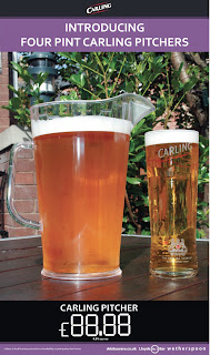
Anyways, working in the.. Retail industry, I've had the opportunity to create a few posters for Wetherspoons. Given that they usually all stick to the standard plain layout with complementary colours and a shiny, pasted in photograph from the huge collection of stock images, it's a good bit of experience to have.

They're pretty basic but effective, they do their job as a point of sale and advertise something cheap wth a pretty photo to compliment it (well, besides that awfully frosted Carling pitcher).


^ terrible attempt.


More recent!

Right let's get started on some designs that are a bit more recent then. Here's a few from the Uni sketch book. Worst of the bunch because my other two went missing but nevermind.
These are mainly conceptual design and print work created for various briefs whilst at Uni.
I'd go into more detail but there's literally about four separate projects there and it would quite a few paragraphs ;). 


So, college work.


May as well get the trash out of the way! Bear in mind this was a good four years ago now. 
These are all basically from playing around in Photoshop, when I'd first started really getting into PS and digi-painting
Honestly can't really say much about them, inspiration wise I can't really remember -- other than the photo below. That was fucking hilarious to make. 


Back again! For the.. fifth time?


The default font for this is Times New Roman? Really? That's just awful..
Anyway, hi there, welcome to some pretty average designs! 

This blog is basically just a showcase of (some of) my work throughout a few years. I'm going to start out from some awful designs when I was in college to now, which I guess is post-threequatersofayearofuniversity?

This basically extends from basic design focused on to a brief to some more recent business POS, aswell as basic trolling around on Photoshop. 
The main inspiration is, well, mainly to get me working again. In order to design you have to have a client, right? 

Anyway, cheers for reading, I'll start with some cheesy college work. Christ..

GDJ


PS. Hi, my name's Grant, and everyone needs a good, hammered photo.