Saturday 24 August 2013

Bauhaus!


Rightyo! 
I've been wanting to do some Bauhaus designs lately, just to play around with a few shapes and some typography. 
Part one of maybe three or four until I move onto something else (maybe something a little less seventy years ago!). Aiming for an update per day here so here's part one


Ironically for my first Bauhaus inspired design I've used a photograph as opposed to just architecture and typography. Ah well. 
I've tried to keep the outlines of the shapes feathered and the stock crisp as it is the focal point of the three layers. Just a quick and cheerful design! Going to play with some typography tomorrow. I hope. Probably not, but I hope.
Toodles.

Wednesday 14 August 2013

Bit of mixed media concept art


Just a quick update on finally finishing a drawing that I completed a while ago but needed to get some ink for the lips and eyes.
Enjoy how it turned out! Concept art from Batman based on one of the front covers of Kirby's comics (as far as I can remember!)
Anyway, hope you like it, was wicked to make.


Tuesday 13 August 2013

Booyah, on to Photo Manipulations

Finally getting there now. These are the last two updates and then I'll have to design to keep the blog up and running, which was the whole purpose of this. 

Got another two designs that I loved making. 
The first was part of a twenty-minute poster design challenge. Quite literally you have twenty minutes to create a poster. 
The second was another steam-punk design but based on photo manipulations


This is the twenty minute poster. I was basically just trying to string a few images together to represent how North Korea's politics are currently (well, I say currently, but they've always been horny for violence, propaganda and slavery) in order to create a propaganda poster that, in all honesty, I would be surprised if they used. 
The Korean writing is also a quote from 1984 which was perfect for the scenario of the poster. If you can't guess already, the quote is:
 "WAR IS PEACE, 
FREEDOM IS SLAVERY, 
IGNORANCE IS STRENGTH."


This is the steam-punk inpsired poster. As the genre is mostly concept design illustrations, I wanted to take more of a real life approach. I tried to be as subtle as possible as well, meaning that you'd have to give it a second glance in order to see what manipulations I'd actually done to create the poster. I really enjoy the design used for it and consider it as some of my better work.

That's it for now folks, I'll be back soon once I finish up a couple more! 

Digi and mixed media paint

Got two paintings today (well, not today, but uploaded today!)
Experimentation on concept design for the first one and a bit of a political statement for the second. I'll just dive straight in.


This first design was going to be part of a two page steam-punk related comic I was intending to design, however I sorely just don't have the time for a full on project. The concept, as stated, was for steam-punk. It was based on mechanical bodies with only a projected face - with inspiration from Ashley Wood. This is as far as I on the painting side (thing took like ten hours, I barely get that off work in a week :P). 
One of the first digi paints that I'd done, I'm much more of a poster/photo manipulation guy, so I don't think it turned out all that bad. 
Love to continue the series, even if not in a comic format but just as a collection of similar concepts. That'll come in time I guess. 


The second is a statement on drinking in England. Well, I state England, but this occurs near enough everywhere in the world historically. 
It was a design done at Uni for an advertisement brief using only printing materials whilst trying to remain abstract. Seriously bad project considering it's incredibly hard to put across any version of shock advertisement considering that you can't really advertise an abstract image! I went for a Bauhaus layout with a spray painted stencil and gouache print solely for a more urban feel. 
It came out all right I suppose, it was meant to imitate a poster of a man vomiting the England flag and making the headlines; a common occurrence. 

Anyway, that's that! Two more to go!

Wetherspoons POS

'Lo all.

Right, now to finally get onto some better designs I've created and my most recent. I'll actually be able to give a bit of annotation from hereon.. yay? 

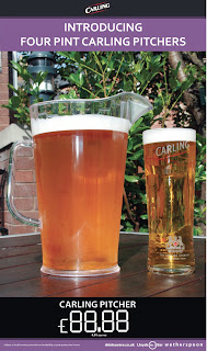
Anyways, working in the.. Retail industry, I've had the opportunity to create a few posters for Wetherspoons. Given that they usually all stick to the standard plain layout with complementary colours and a shiny, pasted in photograph from the huge collection of stock images, it's a good bit of experience to have.

They're pretty basic but effective, they do their job as a point of sale and advertise something cheap wth a pretty photo to compliment it (well, besides that awfully frosted Carling pitcher).


^ terrible attempt.


More recent!

Right let's get started on some designs that are a bit more recent then. Here's a few from the Uni sketch book. Worst of the bunch because my other two went missing but nevermind.
These are mainly conceptual design and print work created for various briefs whilst at Uni.
I'd go into more detail but there's literally about four separate projects there and it would quite a few paragraphs ;). 


So, college work.


May as well get the trash out of the way! Bear in mind this was a good four years ago now. 
These are all basically from playing around in Photoshop, when I'd first started really getting into PS and digi-painting
Honestly can't really say much about them, inspiration wise I can't really remember -- other than the photo below. That was fucking hilarious to make. 


Back again! For the.. fifth time?


The default font for this is Times New Roman? Really? That's just awful..
Anyway, hi there, welcome to some pretty average designs! 

This blog is basically just a showcase of (some of) my work throughout a few years. I'm going to start out from some awful designs when I was in college to now, which I guess is post-threequatersofayearofuniversity?

This basically extends from basic design focused on to a brief to some more recent business POS, aswell as basic trolling around on Photoshop. 
The main inspiration is, well, mainly to get me working again. In order to design you have to have a client, right? 

Anyway, cheers for reading, I'll start with some cheesy college work. Christ..

GDJ


PS. Hi, my name's Grant, and everyone needs a good, hammered photo.